Calculators are dead. At least, the way we have been using them is. The AI mortgage calculator is quickly becoming the new standard, and traditional tools are struggling to keep up.
For years, financial websites have been built around calculators.
Mortgage calculator. Affordability calculator. Payment calculator. Refinance calculator. Interest calculator.
Five different tools asking users to enter numbers, understand financial terminology, change sliders, compare scenarios, and somehow turn all of that information into a decision. We accepted this because that’s how financial websites have always worked.
However, here’s the problem: people don’t want calculations.
They want answers. More importantly, they want confidence in their decisions.
That became the starting point for a project our team at Designsuite.ai worked on for a Canadian mortgage business, replacing a legacy mortgage calculator with an AI powered conversation.
The Problem Wasn’t the Calculator
When we first looked at the client’s existing experience, the website had what you’d expect from a traditional mortgage platform. A collection of calculators. Each one designed to solve a specific mathematical problem.
“How much can I afford?” “What will my monthly payment be?” “How much interest will I pay?” “What happens if the interest rate changes?”
Technically, these tools worked. But from a UX perspective, something was fundamentally wrong. We were asking a person who was already confused about buying a home to understand the financial system before they could use an AI mortgage calculator, or any calculator at all.
They had to know what information mattered. Next, they had to know what numbers to enter. Then they had to understand the terminology. On top of that, they had to run multiple calculations. Finally, they had to interpret the results themselves.
As a result, we were essentially saying: “Here are the tools. Now you figure out what to do.” That’s not a great user experience. This is exactly the kind of friction an AI mortgage calculator is designed to remove.
So We Asked a Different Question

Instead of asking, “How can we make the mortgage calculator better?”, we asked,
“Why does the user need a calculator in the first place?”
In other words, that question changed everything. Because the user wasn’t visiting the website because they loved calculating mortgages. They were there because they had a life decision to make.
Can I afford this house? Should I buy now or wait? What would my monthly payment look like? Can I afford a $700,000 home instead of a $600,000 home? What happens if interest rates change? Should I put down 10% or 20%?
Instead, these aren’t calculator questions. They’re decision making questions.
The Radical Proposal: Removing the Mortgage Calculator Entirely
Our team proposed something that initially sounded almost irresponsible:
Remove the calculators.
Not redesign them. Not make them prettier. Definitely not put them behind a better interface. Remove them, and replace the entire collection of mortgage calculators with a conversational AI experience.
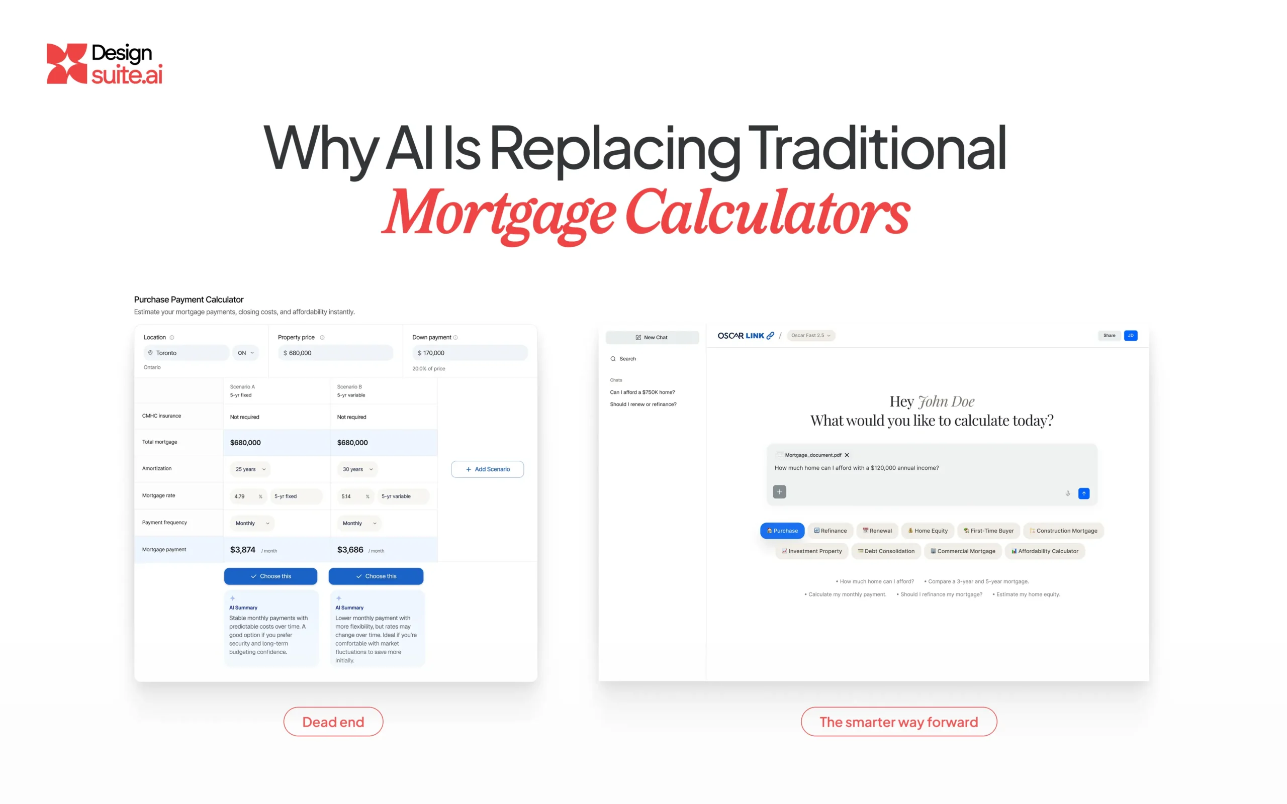
This is what an AI mortgage calculator looks like when it’s built around conversation instead of forms. One intelligent interface. One conversation.
Instead of asking users to understand the mortgage process, we would allow them to simply talk about what they were trying to accomplish. For example: “I’m looking at a $750,000 house. I have $120,000 saved and make around $150,000 a year. Can I afford it?”
Instead of opening three different calculators, entering numbers repeatedly, interpreting graphs, and switching between pages, the AI could guide the conversation. It could ask the next relevant question, calculate the scenarios, explain the result, compare options, and, most importantly, help the user understand what the numbers actually mean for their decision.
This Wasn’t a chat bot Project
This distinction was critical. We weren’t proposing, “Let’s put ChatGPT on the website.” That would have been the easy, and frankly lazy, solution. In fact, a genuine AI mortgage calculator has to do far more than a scripted bot.
We were proposing a completely different interaction model for financial decision making. The AI had to understand the context of the conversation. It also had to know which calculations were relevant. Additionally, it had to ask for missing information. It had to explain financial concepts in plain language. Because scenarios kept changing, it had to handle multiple of them at once. Finally, it had to turn a mathematical result into something a human could actually act on.
The calculator wasn’t disappearing. The calculator was becoming invisible. That’s the difference.
Convincing the Client to Delete Their Own Product
This was probably the hardest part of the project, because removing features feels dangerous, especially when those features have existed for years. The calculators had become part of the website’s identity.
There was an understandable question from the client: “What if people still want calculators?” Our answer was simple: “Let’s look at what they actually want.”
So, we went back to the user’s journey. A person doesn’t wake up thinking, “Today I’m going to calculate my mortgage.” They think, “Can I buy this house?” In short, that’s a completely different problem.
And once we re framed the experience around the user’s decision rather than the company’s tools, the legacy calculator architecture started looking increasingly unnecessary. The challenge wasn’t convincing the client that AI was cool. The challenge was proving that the old interaction model was solving the wrong problem.
From Calculator Tools to AI Conversation
The old experience looked something like this:
User → Calculator → Input → Calculation → Result → Another Calculator → More Input → More Results → User interprets everything
The new experience became:
User → Conversation → Context → Calculation → Explanation → Decision
As a result, that difference is enormous. The AI became the layer connecting multiple financial tools together. Instead of making the user understand the system, the system understood the user.
And Something Interesting Happened
The biggest improvement wasn’t actually the calculation. It was the decision time. Users no longer had to jump between multiple tools to understand their situation. They could ask follow up questions naturally, change assumptions, and explore scenarios.
They could ask: “What if I put $50,000 more down?” Then: “What would my monthly payment become?” Then: “Would buying a cheaper home make a meaningful difference?” Then: “What price range would be more comfortable for me?”
Overall, that’s a completely different experience from filling out a static form. The user isn’t just calculating anymore. They’re thinking with the product. And that is where the real conversion opportunity appeared.
Simplicity Improved More Than UX
Removing the calculators didn’t simply make the website cleaner, it changed how the AI mortgage calculator experience felt from start to finish. It reduced cognitive load. It also reduced the number of decisions required from the user. Because there was no more switching between tools, it reduced navigation too. And it reduced the amount of financial terminology users had to understand.
And it shortened the distance between “I’m curious” and “I’m ready to talk to someone.” That’s an important distinction for any financial product. Because conversion doesn’t happen when a user finishes a calculation. Conversion happens when uncertainty becomes confidence.
The Design Lesson
This project reinforced something we believe strongly at Designsuite.ai:
Great UX isn’t about giving users more powerful tools. Instead, it’s about making powerful tools disappear behind a simpler experience.
The mortgage calculations didn’t disappear. Nor did the financial logic. And the complexity certainly didn’t disappear either. The user just stopped carrying it. Ultimately, that’s what good design does.
The Future of Interfaces Isn’t More Buttons
For decades, software has taught humans how to use software.
Click here. Select this. Enter this number. Open another tool. Change this value. Run the calculation. Read the result.
As a result, AI is allowing us to reverse that relationship. Instead of teaching users how the software works, we can build software that understands how users think. That is a profound shift, and it changes how we should approach legacy interfaces.
The question is no longer, “How do we redesign this calculator?” It becomes, “Does the user need to know that a calculator exists?”
Calculators Aren’t Really Dead
The mathematics isn’t dead. Neither are the algorithms. And the financial models certainly aren’t dead either. What’s dying is the idea that the user should be responsible for operating them. The best AI mortgage calculator is increasingly becoming one the user never sees.
Because when technology becomes powerful enough, the interface can move from “Give me the inputs” to “Tell me what you’re trying to accomplish.” And that’s where simplicity gets really interesting, because the final interface may look incredibly simple. But underneath it, there may be hundreds of calculations, decisions, rules, models, and systems working together.
That’s the paradox of simplicity. The simpler the experience looks, the harder the design work usually was.
Beyond Just Designs
At Designsuite.ai, we don’t believe the future of UX is about making yesterday’s interfaces prettier. Sometimes the best redesign is knowing what should no longer exist. Ultimately, that’s the philosophy behind every AI mortgage calculator we build at Designsuite.ai.
And sometimes, the most powerful thing a designer can do is walk into a room and say, “Let’s delete it.”
Bibin Little CEO,
Beyond Just Designs