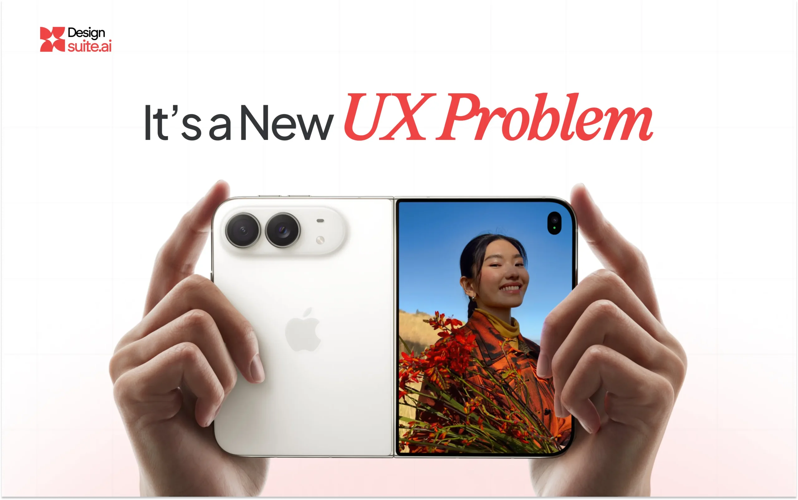
Apple has always understood something that many product teams overlook: when the hardware changes, the interface has to change with it. The iPhone Duo is a perfect example.
At first glance, it is Apple’s entry into the foldable smartphone category. But from a UX perspective, the more interesting story isn’t the hinge, the titanium frame, or even the massive inner display.
It is what Apple has done with the software.
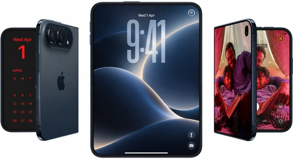
The iPhone Duo introduces a compact, almost passport like form factor when closed, with a 5.4 inch outer display that opens into a 7.6 inch inner display. Rather than simply stretching the existing iPhone interface across a larger screen, Apple has redesigned iOS around the way people will actually hold, open and interact with the device. And that is where the real design lesson begins.
Controls Are Moving to Where Your Thumb Actually Is
One of the most interesting changes in iPhone Duo’s UX is the repositioning of navigation and controls. Instead of consuming valuable space at the bottom of the interface, many controls, toolbars and tab bars are positioned along the side of the device.
Why? Because the physical form factor changed.
When you’re holding a wider, passport sized device, reaching the bottom of the screen isn’t necessarily the most natural interaction. Moving controls vertically along the side creates a more ergonomic interaction zone while also giving the content more vertical space.
Apple’s own design guidance explicitly recommends positioning toolbars, tab bars and controls along the side of the Duo so they are easier to reach.
This is a small UI decision with a very large UX implication:
Don’t design for the screen. Design for the person holding the screen.
Liquid Glass: Making UI Feel Less Like UI
Apple’s Liquid Glass design language adds another layer to the iPhone Duo experience.
Rather than making controls feel like fixed objects sitting on top of the content, Liquid Glass uses translucency, reflection, refraction and fluid transitions to allow the interface to adapt dynamically while keeping the user’s content at the center.
On the Duo, this becomes even more interesting. The interface has to respond as the device:
Opens → Closes → Folds → Rotates → Changes orientation → Changes screen size
The software isn’t simply displaying information. It is responding to the physical state of the device. That is where modern UX is heading.
One App. Two Screens. Completely Different Information Architecture
The inner display is where the iPhone Duo becomes particularly powerful for product designers. Apple has introduced Split View, allowing users to run two apps side by side for the first time on iPhone. Users can also open two windows of the same app. For example, two Safari windows and save pairs of apps for quick access later.
Imagine what this dual screen capability means for applications:
- Healthcare Professional: Patient Information | Clinical Workflow
- CEO: Dashboard | Communication
- Sales Executive: CRM | Proposal
- Financial Professional: Portfolio | Research
The inner screen isn’t simply “more screen.” It creates a new information architecture. And that means existing mobile applications cannot simply be scaled up and called Duo ready. They need to be rethought.
The Real Opportunity for Product Teams
This is where the iPhone Duo becomes particularly important for businesses. A company that has invested heavily in a mobile application now has another question to answer:
What should our product become when the user’s screen suddenly doubles in usable space?
Should the navigation remain at the bottom? Can the application become a two column experience? Should users see a list on one side and details on the other? If certain workflows become simultaneous, could an AI assistant occupy one side while the user’s primary workflow remains visible on the other? Should the interface change depending on whether the device is folded, partially folded or completely open?
These aren’t visual design questions. They’re product strategy questions.
And this is exactly why the next generation of mobile UX will be less about designing individual screens and more about designing adaptive experiences.
The $1,999 Price Point Changes Everything
The iPhone Duo starts at $1,999 in the United States, positioning it firmly in the premium/luxury segment.
That means this isn’t necessarily a device businesses can treat as just another screen size. It is likely to appeal strongly to:
- Premium consumers
- Executives and C suite professionals
- Affluent professionals
- High net worth individuals
These users are willing to pay for a more powerful and differentiated mobile experience. And that creates an interesting expectation: Premium hardware demands premium software.
If your customers are using a $2,000+ device to interact with your brand, your application shouldn’t feel like it was designed exclusively for a conventional smartphone five years ago.
The Future of Mobile UX: Beyond Just Design
We believe UX isn’t just about making an interface beautiful. It’s about understanding:
- How people hold it
- How they reach it
- How they navigate it
- How they think
- How they work
- How the technology around them is changing
The iPhone Duo is a great reminder of that philosophy.
If you are building a new mobile product, your UX strategy should consider the iPhone Duo’s:
- Outer display and inner display optimization
- Adaptive layouts
- Side based controls
- Multitasking capabilities
- Different device poses
And if you already have an application? This is the right time to ask whether your existing UX is ready for what’s next.
Ready to Optimize Your Mobile App for the Future?
At Designsuite.ai, we help companies design, redesign and continuously evolve digital products for modern users and modern devices.
We’re currently offering a limited number of FREE UX Reports.
We’ll review your product, identify key UX opportunities and share our recommendations. Want us to take a look?
Book a quick conversation with our team at designsuite.ai
Because the future of mobile isn’t just about bigger screens. It’s about designing experiences that understand how people use them.