Corporate Website
2 - 4 Weeks
Cannect
Toronto, Canada
Finance · Mortgage Brokerage · Home Equity & Lending
Building Canada’s Most Transparent, People-First Mortgage Experience
We partnered with GI Partners to enhance their digital presence and improve gastroenterology care communication across multiple locations. The goal was to convey clinical excellence and patient trust through a clear, scalable digital experience for both patients and providers.

Bringing clarity and trust to a complex financial journey
Cannect operates in the competitive Canadian mortgage market with a unique positioning: not just as a broker, but as a transparent, client-centric home financing partner. While traditional banks rely on rigid underwriting, opaque fees, and standard products, Cannect’s model focuses on clear, unbiased mortgage solutions — often enabling approvals where conventional lenders don’t.
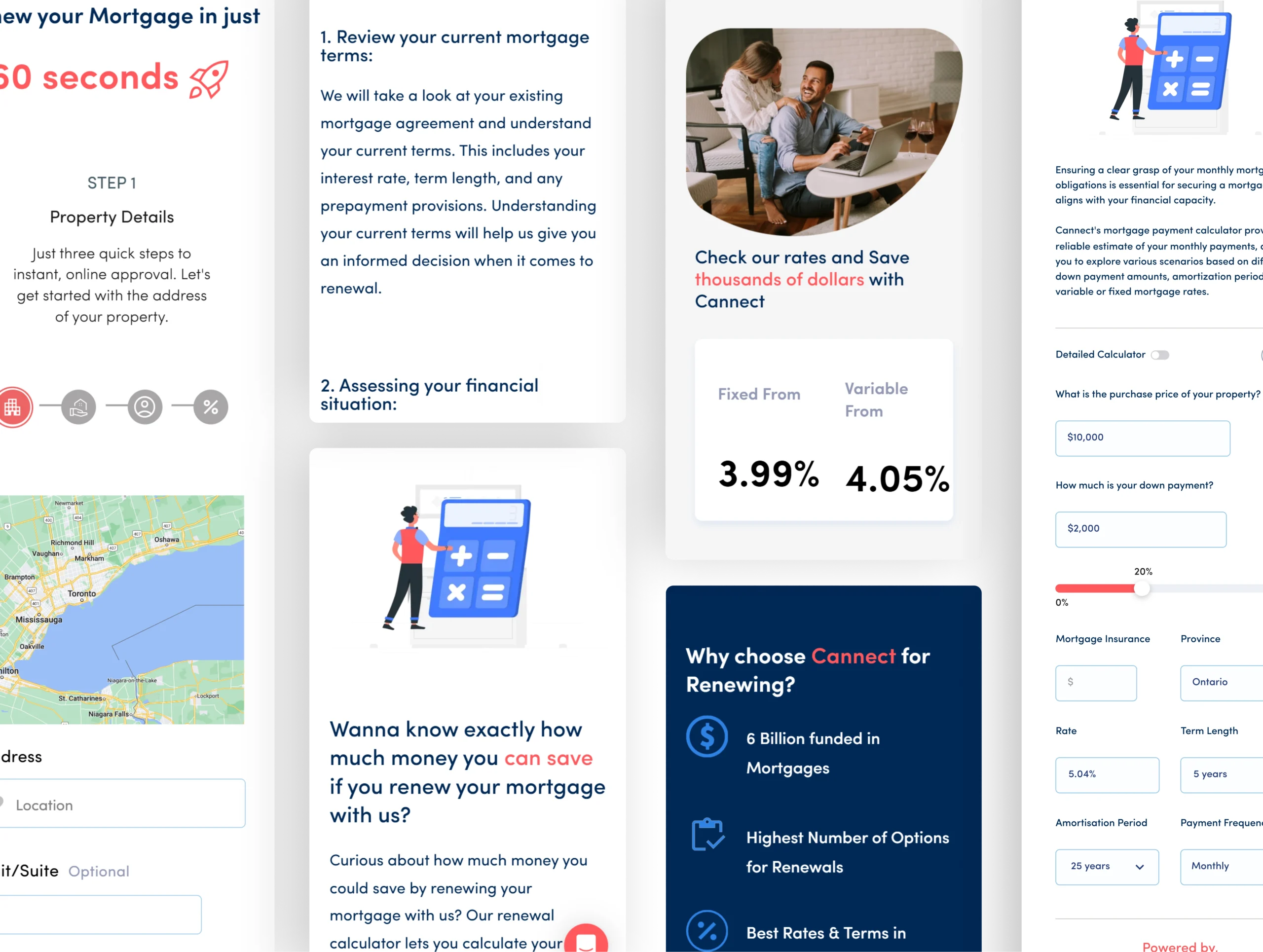
Turn confidence into action with intuitive design.
We anchored the experience around clarity, transparency, and user empowerment — using a strategy built on how Canadians actually think about mortgages, not how lenders assume they do. Every screen, interaction, and content section was designed to reduce friction and guide users from awareness to decision with confidence.

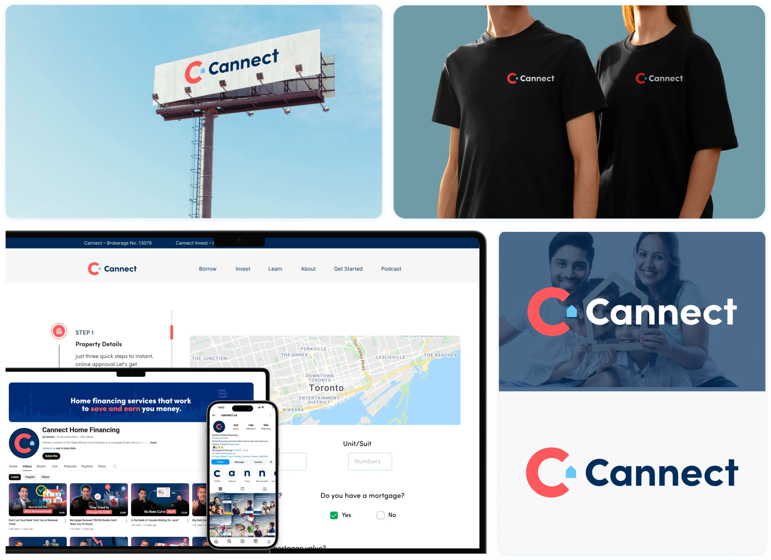
Key Areas We Set Out to Improve
A focused set of goals to strengthen brand perception and usability:

Convey Cannect as Canada’s trusted mortgage partner.
Simplify the financial journey from awareness → comparison → decision.
Inform users about mortgage types: purchase, refinancing, renewal, CannectFlex.
Build trust for borrowers and investors with transparent messaging.
Enable scalability with modular content and reusable UI components.
Every idea matters. our discover team will personally review yours. Email us or book a call to start the conversation.
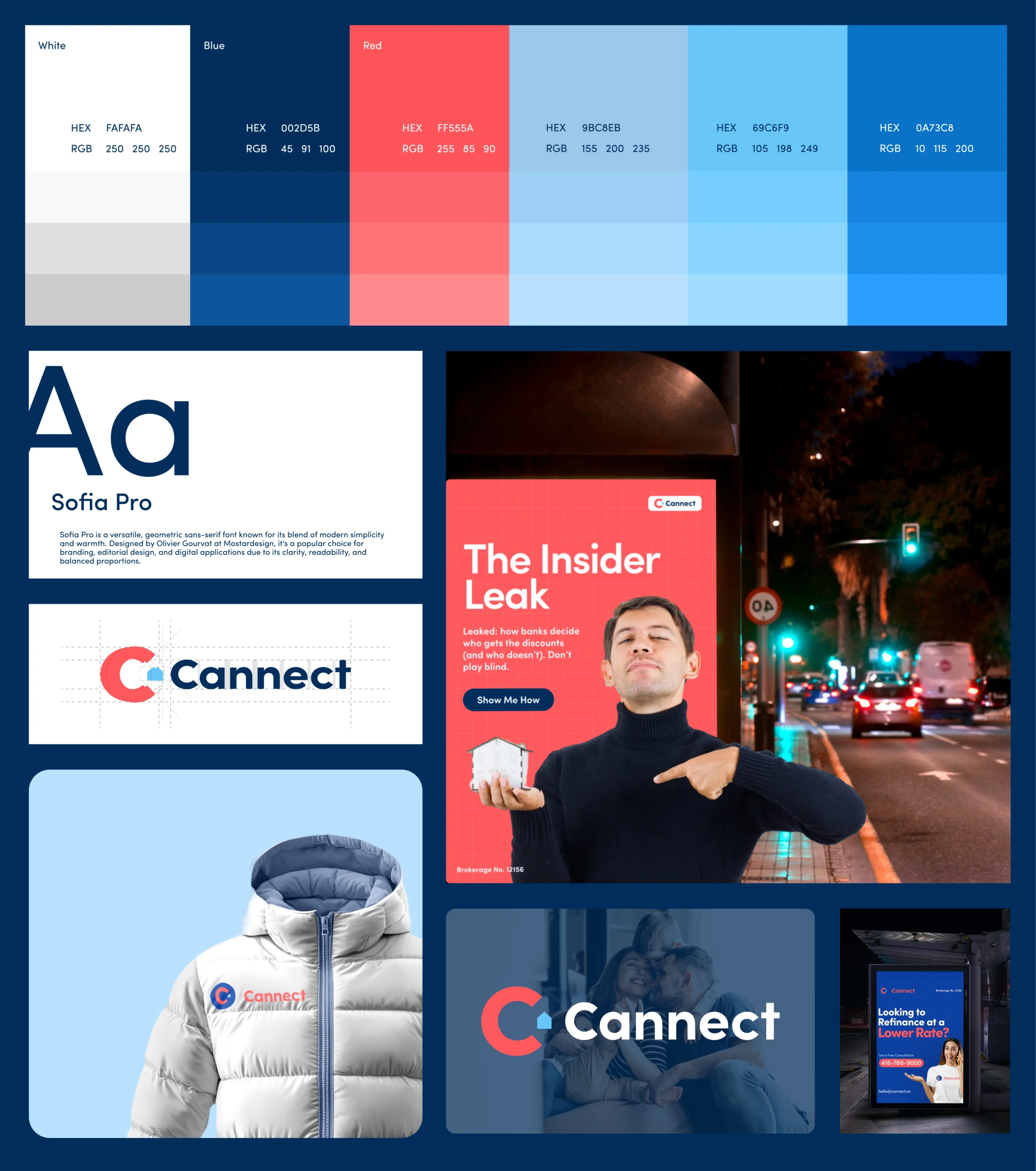
A Financial UI Focused on Trust and Transparency
We introduced a structured design system tailored to a financial services context — balancing clarity with authority. The system included:
- Typography: Calm, legible typefaces for effortless readability
- Color: A trust-oriented palette with neutral neutrals and accent blues/greens
- Layouts: Flexible components for rate tables, application steps, and education modules
- Patterns: Reusable elements for calculators, form flows, and mortgage option comparisons
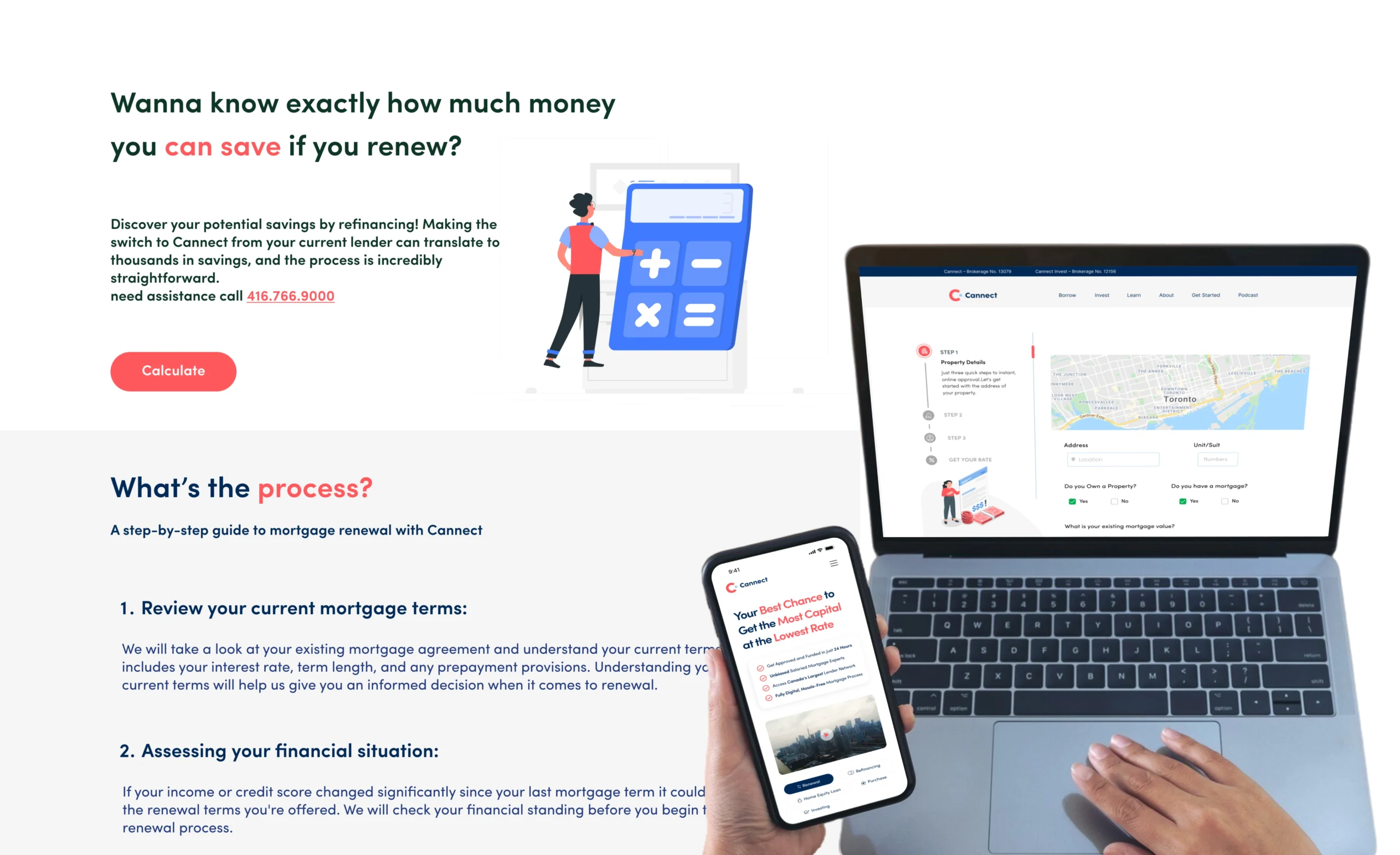
Design that Aligns With Real Borrower Needs
The UI focused on confidence and ease of use: predictable navigation, progressive disclosure of information, and visible support cues (e.g., loan types side by side, eligibility explanations). This reduced friction for users unfamiliar with financial products, a major differentiator in mortgage digital experiences.

“I was skeptical about adding another tool to our tech stack, but Propel proved its worth in the first month. Best business decision we made this year.”
COO of GI Partners

