Corporate Website
2 - 3 Weeks
GI Partners of Illinois
Illinois, USA
Healthcare · Gastroenterology · Digestive Health
Building a Patient-First Digestive Health Brand Rooted in Trust and Expertise
We partnered with GI Partners to enhance their digital presence and improve gastroenterology care communication across multiple locations. The goal was to convey clinical excellence and patient trust through a clear, scalable digital experience for both patients and providers.
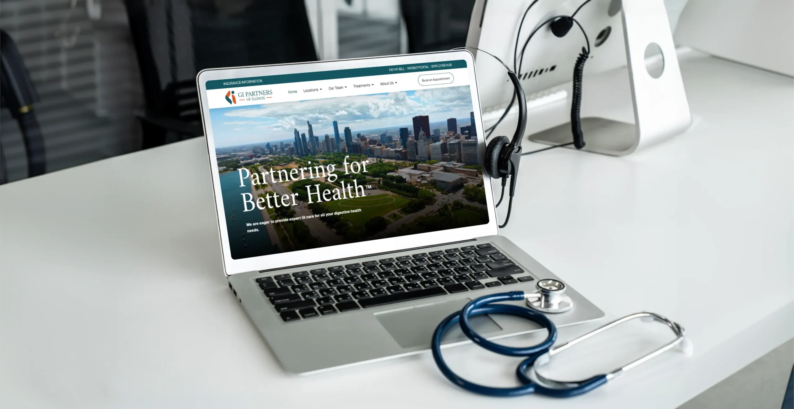
Communicating Medical Expertise Without Losing Human Connection
GI Partners of Illinois delivers advanced, physician-led digestive care across multiple practices and locations. However, the existing digital experience struggled to clearly communicate scale, specialization, and trust while remaining approachable for patients navigating sensitive health concerns.
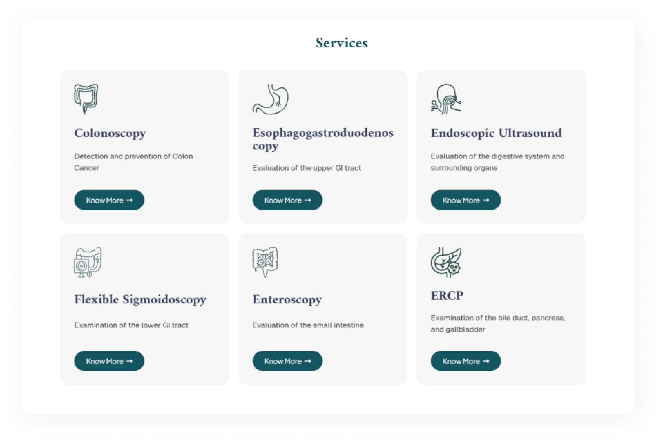
Clarity, Credibility, and Care Continuity
The experience was structured around how patients actually think and feel when seeking GI care. We prioritized clarity over complexity, guiding users from symptoms and services to physicians, locations, and next steps with minimal friction.
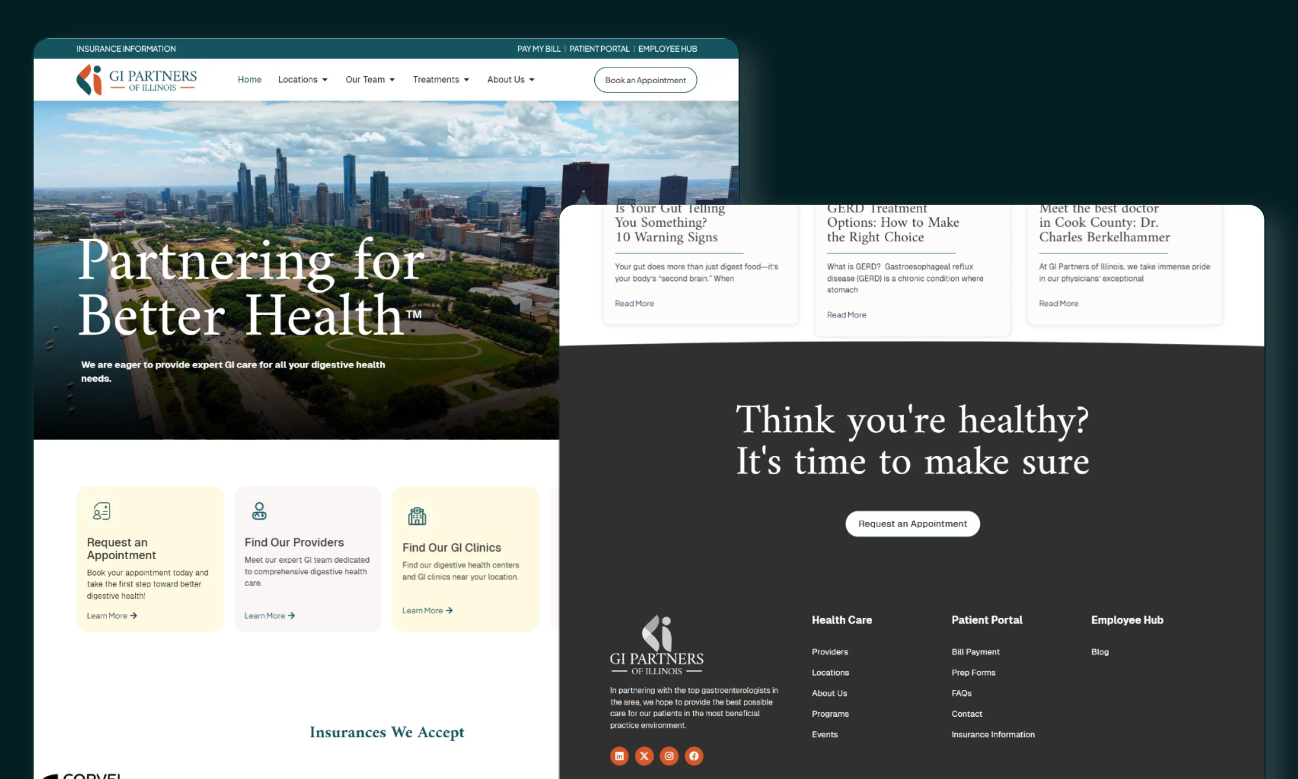
Key Areas We Set Out to Improve
A focused set of goals to strengthen brand perception and usability:

Position GI Partners as a trusted, physician-led GI network
Clearly communicate specialized services and procedures
Improve patient navigation across locations and providers
Support long-term growth and digital scalability
Clear content hierarchy for medical services
Reinforce credibility through structure, tone, and consistency
Every idea matters. our discover team will personally review yours. Email us or book a call to start the conversation.
A System Designed for Healthcare Trust
The design system introduced consistency across typography, color, layouts, and components—ensuring reliability and familiarity for patients. Clean interfaces and reusable patterns allow medical content to scale without visual noise, supporting both clarity and compliance.
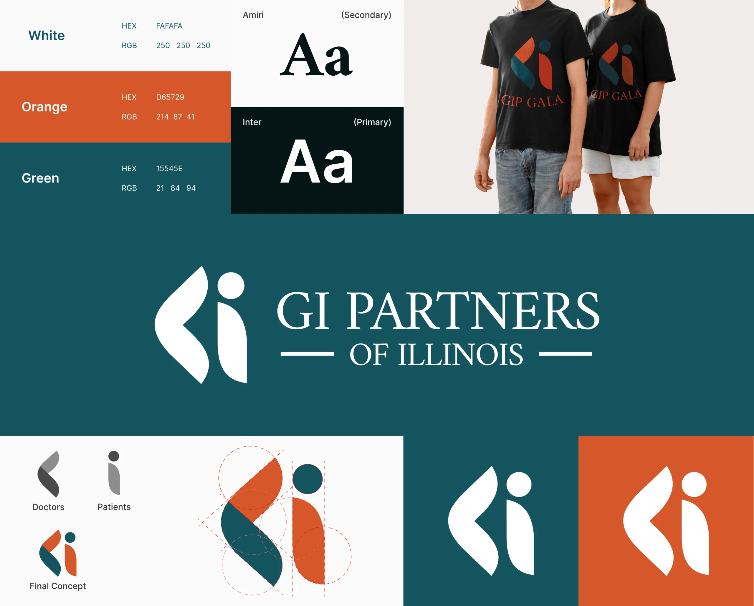
Designing for Confidence, Comfort, and Ease
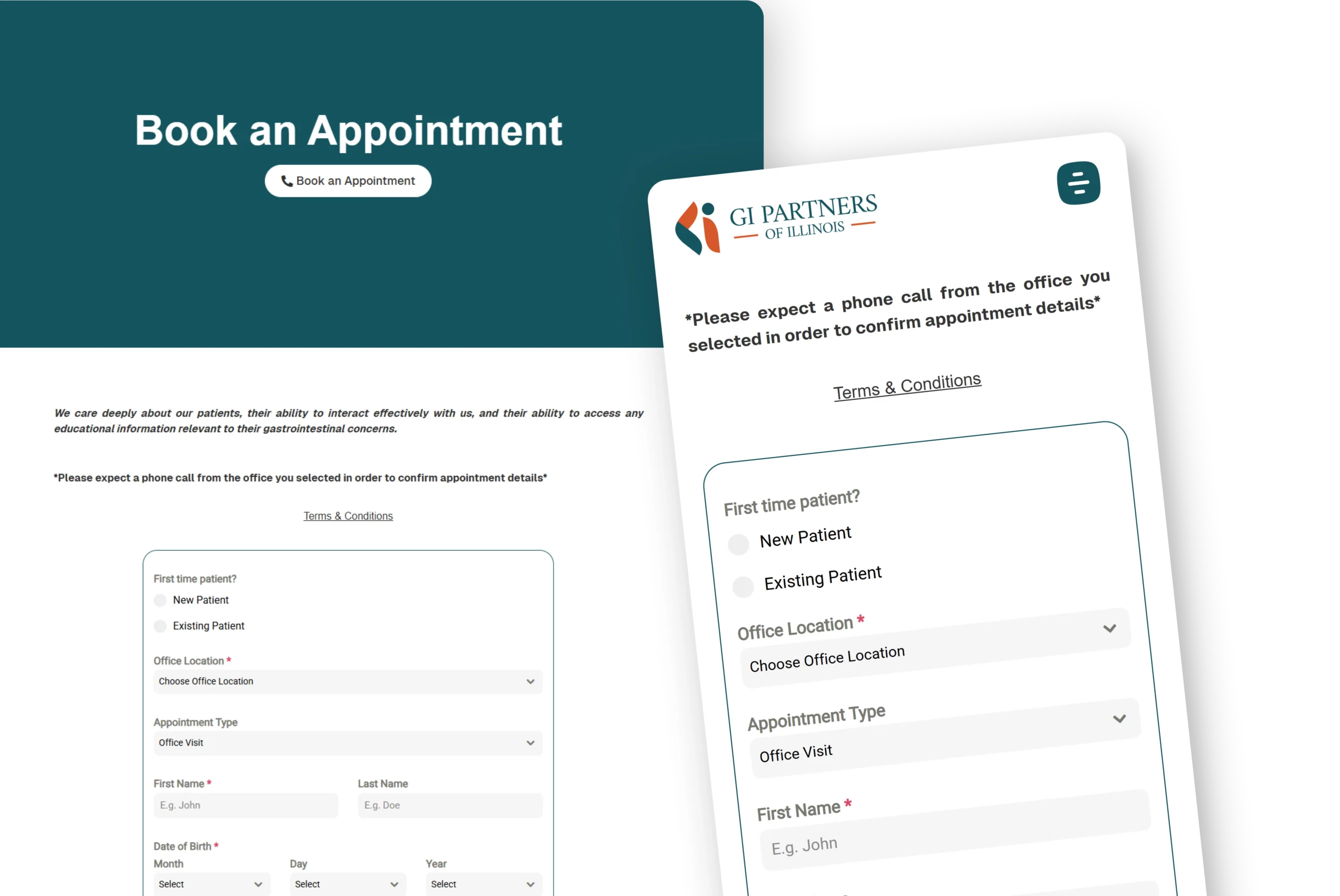
The UI framework focuses on calm, structured layouts that reduce cognitive load—especially important in healthcare contexts. Predictable navigation, readable typography, and strong visual hierarchy help patients quickly find the care they need, while reinforcing professionalism and trust.

“I was skeptical about adding another tool to our tech stack, but Propel proved its worth in the first month. Best business decision we made this year.”
COO of GI Partners

