
Every few years, a technology company introduces a feature that changes the way we interact with devices. And then there are moments when an entire design philosophy changes. Apple’s new Siri experience, combined with the latest iOS 26 design evolution, feels like one of those moments. As designers, we often obsess over pixels, typography, spacing systems, and component libraries. But the real goal of design has never been creating beautiful interfaces. The goal has always been to create experiences that feel natural.
Apple’s latest approach to Siri, Dynamic Island, and the Liquid Glass design language moves us closer to a future where technology feels less like software and more like an extension of human thought.
Siri Is No Longer an Assistant. It’s Becoming a Memory Layer.
For years, voice assistants have suffered from a fundamental UX design problem: they forget. Every interaction felt like starting a conversation from scratch.
Ask a question. Get an answer. Start over.
The new Siri in iOS 26 changes that dynamic entirely. By remembering previous conversations and maintaining context over time, Siri begins behaving less like a tool and more like a digital companion that understands continuity.
From a UX design perspective, this is a massive shift. Humans don’t communicate in isolated prompts. We reference previous discussions, build on context, leave thoughts unfinished and return to them later.
The smartest thing Apple has done isn’t to make Siri more intelligent. It’s making Siri remember. Great experiences are not built on intelligence alone. They’re built on continuity. And continuity is what creates trust.
Dynamic Island Has Finally Found Its Purpose
When Dynamic Island was first introduced, many designers admired the innovation but questioned its long-term utility. Was it genuinely useful? Or was it simply a clever way to disguise hardware limitations?
The latest iOS 26 experience finally provides the answer. Dynamic Island now feels less like a notification container and more like a living interaction layer. Information appears exactly when needed. Conversations remain accessible. Tasks continue without forcing users to constantly switch contexts.
From a UX design standpoint, Apple is solving a challenge every designer faces:
How do you surface information without interrupting the user?
Traditional notifications demand attention.
Dynamic Island offers awareness instead.
That’s a subtle but incredibly important distinction.
The best interfaces don’t scream for attention. They whisper.
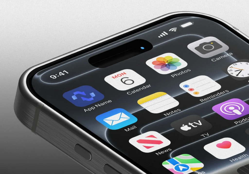
The Liquid Glass Design Language Is More Than Visual Polish
At first glance, the new Apple Liquid Glass design language introduced in iOS 26 looks stunning. Layers bend light naturally. Transitions feel organic. Surfaces appear to have depth and movement.
But the true achievement isn’t aesthetics. It’s perception. Great visual design helps users understand hierarchy without thinking about it. The transparency, reflections, and fluid motion create a stronger sense of spatial awareness throughout the operating system.
Users instinctively understand what is active, what is secondary, what belongs in the foreground, and what exists in the background without reading instructions, without tutorials, without effort.
This is where visual design becomes UX design. When executed properly, beauty isn’t decoration. Beauty becomes guidance.
Apple Is Designing for Context, Not Screens
Perhaps the biggest lesson isn’t the new visuals or even the smarter Siri. It’s Apple’s growing focus on context-aware design.
For decades, software was designed around screens. Open an app. Complete a task. Close the app. But modern users don’t think in apps. They think in outcomes, that is “I need directions,” “I need information,” “I need to remember something,” “I need to continue a conversation.” The interface should adapt around those needs, not force users into predefined workflows.
With Siri’s memory, Dynamic Island’s persistent interactions, and the Liquid Glass design language tying everything together, Apple is moving toward a future where interfaces become increasingly invisible. And that’s the ultimate goal of UX design, not making users notice the interface, but making them forget it exists.
What Designers Can Learn From This
The biggest takeaway isn’t to copy Apple’s visual style. Every UI/UX design trend eventually changes. What matters is the principle behind it.
This new generation of Apple iOS 26 experiences reminds us that great products are built on three foundations:
Memory
Experiences should remember users and maintain context.
Continuity
Interactions should feel connected rather than fragmented.
Clarity
Beautiful visuals should improve understanding, not simply impress.
When these three elements come together, products stop feeling like software. They start feeling intuitive.
Is Your Product Creating the Same Experience?
Most businesses today are still focused on features. Very few are focused on creating user experiences that people remember. The reality is that customers don’t leave products because they lack features. They leave because the user experience feels confusing, disconnected, or outdated.
The companies that will win in the AI era won’t necessarily be the ones with the most advanced technology. They’ll be the ones who deliver the most seamless user experience.
Free UX Consultation from Designsuite.ai
If you’re building a SaaS platform, mobile application, healthcare product, eCommerce experience, or enterprise software, our team at Designsuite.ai can help you identify UX design bottlenecks, improve user journeys, and uncover opportunities to increase engagement and conversions. As part of our complimentary UX consultation, we’ll review your product and provide actionable recommendations from a user experience and product strategy perspective.
Book your FREE UX Consultation today and discover how small UX design improvements can create massive business impact. Because great products aren’t built by adding more features. They’re built by making every interaction feel effortless.
Final Thoughts
As designers, we’re entering an era where AI, context-aware design, and adaptive interfaces are converging into a single experience layer. The winners won’t be the companies with the most features. They’ll be the companies that make technology feel effortless.
Apple’s latest iOS 26 Siri experience offers a glimpse of that future — not because it looks different, but because it behaves differently. And in UX design, behavior will always matter more than appearance.
Beyond Just Designs


")