Web Application
2 - 3 Weeks
Go Visualize
United States
SaaS / Data & Analytics
Simplifying Data into Actionable Visual Intelligence
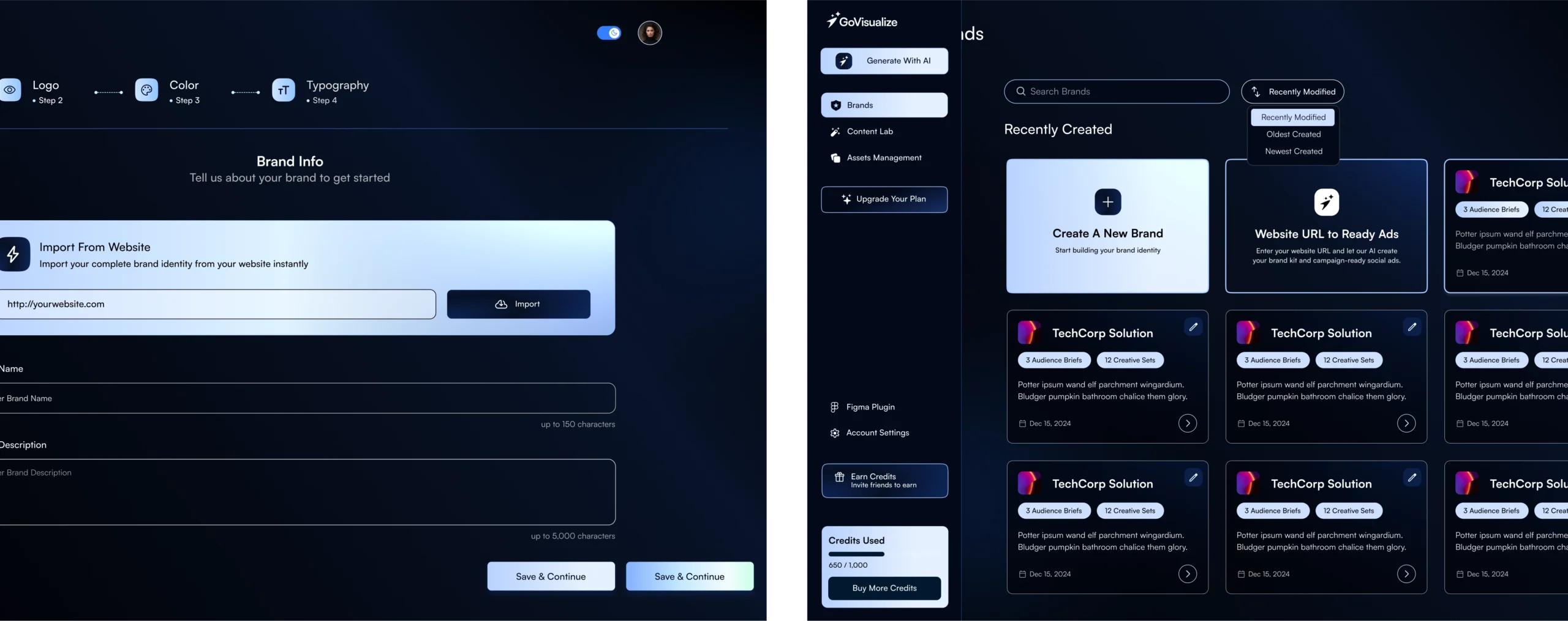
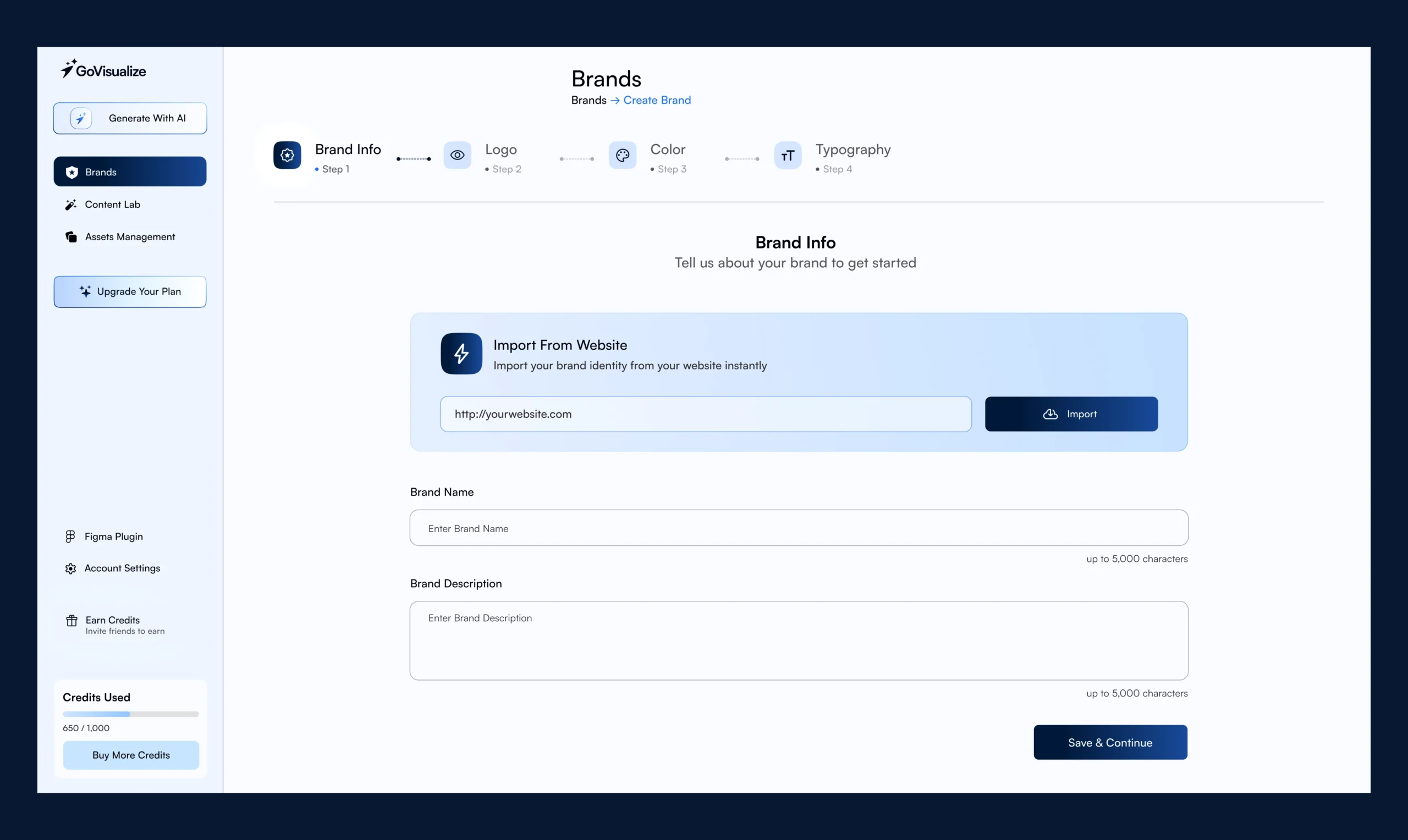
We collaborated with Go Visualize to enhance their analytics experience, improving usability and clarity. The new interface turns complex data into intuitive visuals, helping teams explore trends and make confident decisions.
Making Data-Dense Dashboards Easy to Understand
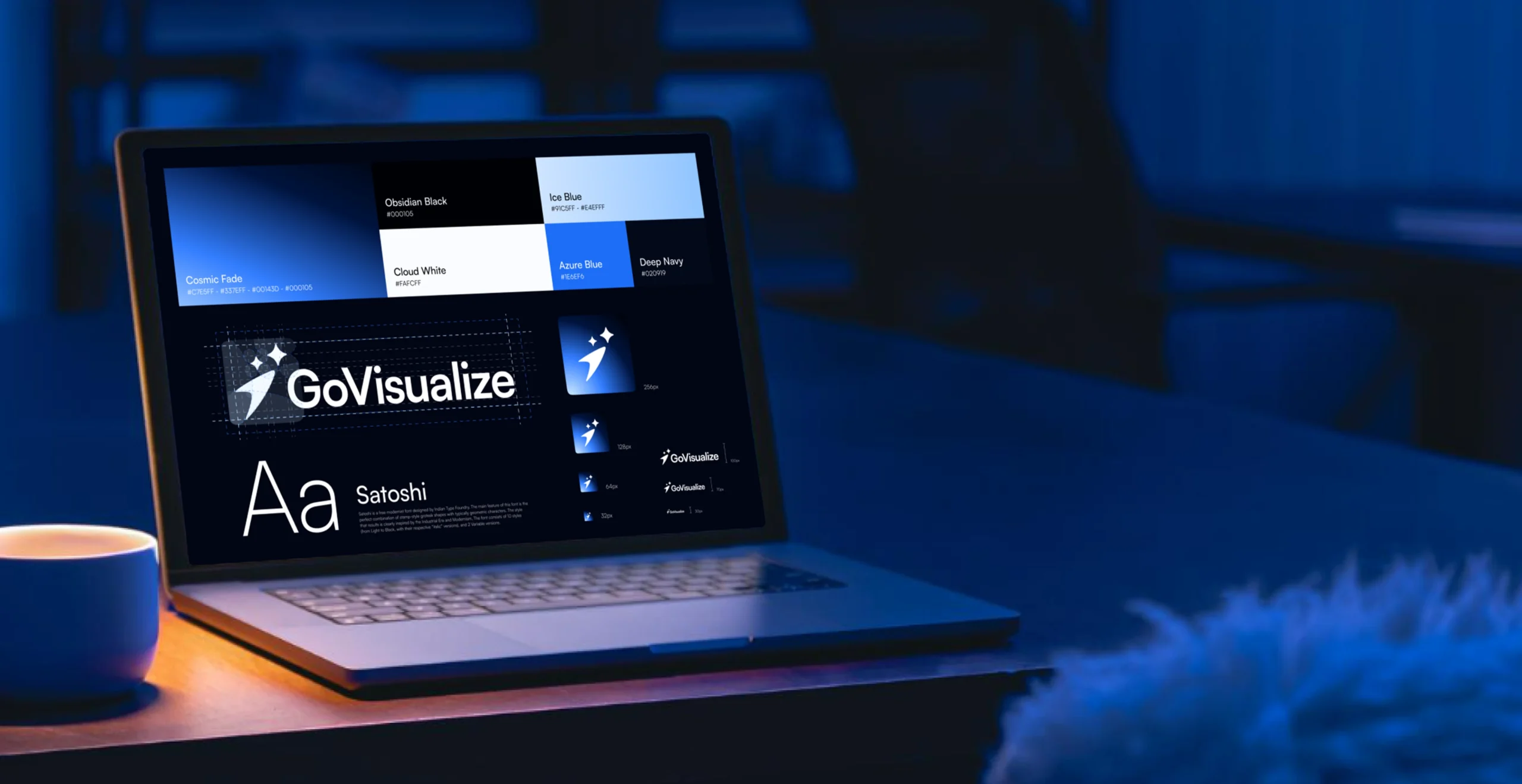
Go Visualize offered powerful visualization and reporting capabilities, but users struggled with dense dashboards, inconsistent layouts, and unclear data hierarchy. Key insights were often buried under layers of charts and controls. The challenge was to simplify the experience while retaining analytical depth for advanced users.
Clarity, Structure, and Visual Hierarchy First
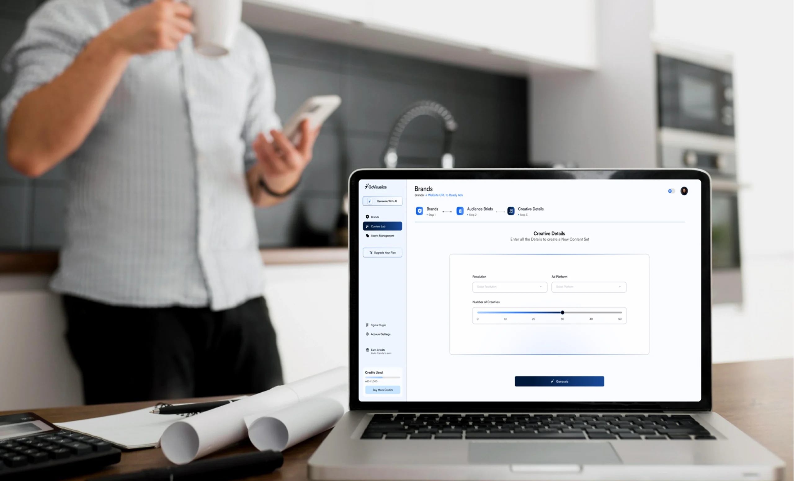
We redefined the information architecture to prioritize critical metrics and natural data flow. Dashboards were redesigned with clearer hierarchy, improved spacing, and consistent chart behavior. A clean, modern visual language helped users scan trends quickly, compare metrics effortlessly, and focus on insights that drive action.
Key Areas We Set Out to Improve
A focused set of UX improvements aimed at speed, clarity, and scalability:

Simplify complex dashboards and data views
Establish consistent, reusable visualization components
Improve navigation across reports and data sources
Reduce cognitive load for first-time users
Enable faster insight discovery and comparison
Modernize the overall look for trust and clarity
Every idea matters. our discover team will personally review yours. Email us or book a call to start the conversation.
A Scalable System for Data-Heavy Products
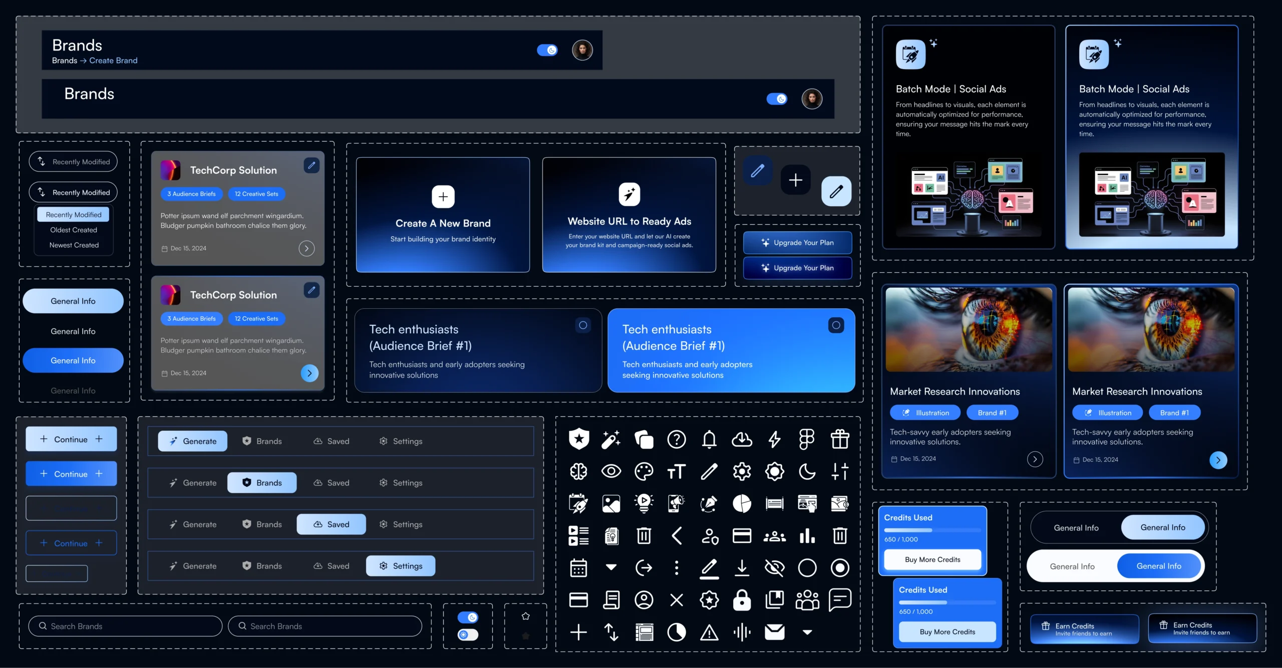
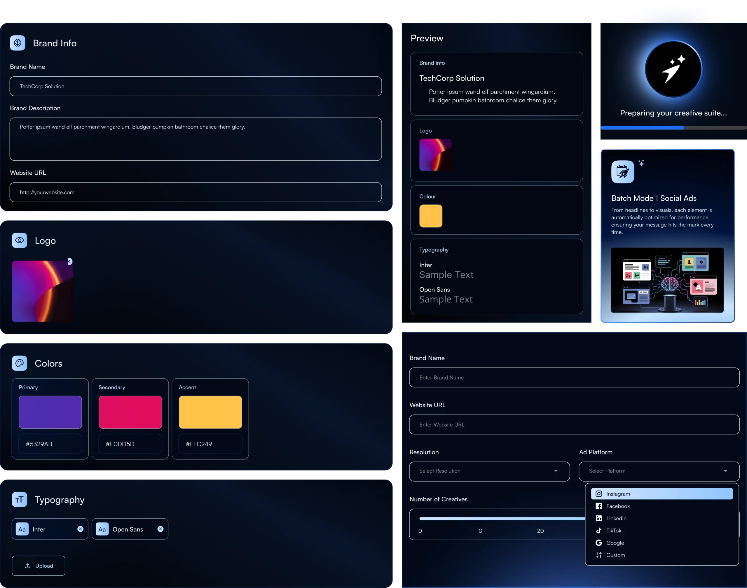
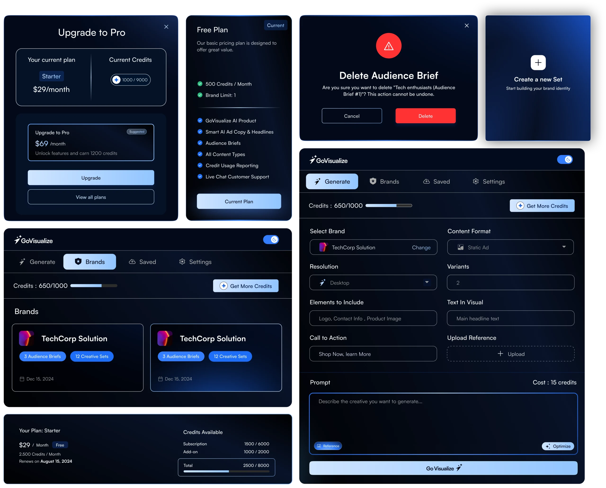
We introduced a modular design system with standardized charts, filters, tables, and interaction patterns. This system ensures visual consistency across the platform while allowing Go Visualize to scale features and datasets without redesign overhead.
Designing Dashboards That Think Like Users
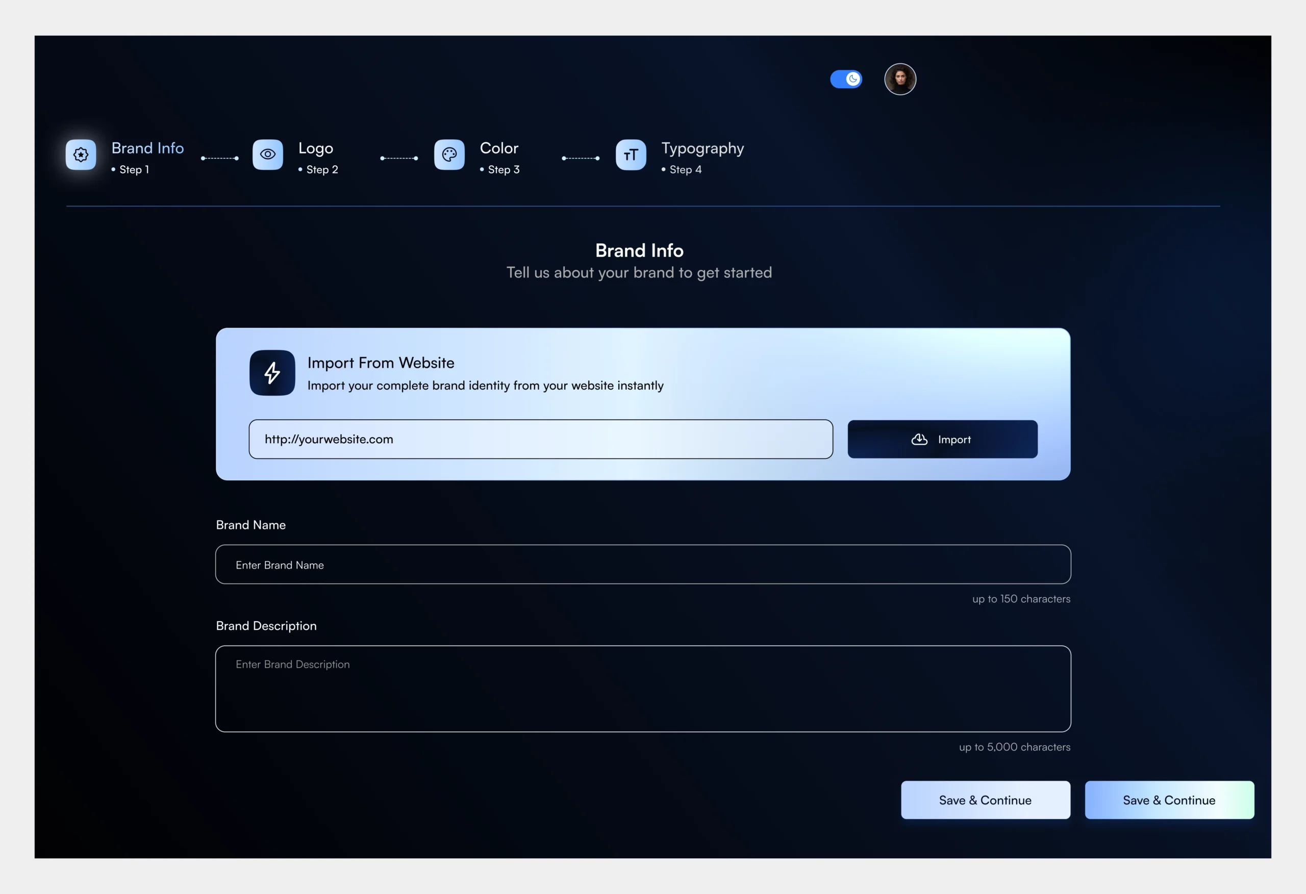
The new UI balances analytical depth with usability. Predictable layouts, consistent interactions, and clear visual cues help users explore data confidently, whether they’re tracking performance, spotting trends, or presenting insights to stakeholders.

“I was skeptical about adding another tool to our tech stack, but Propel proved its worth in the first month. Best business decision we made this year.”
COO of GI Partners

